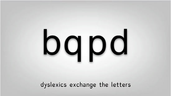
A team from the University of Twente, in the Netherlands, has developed a new ‘Dyslexie’ typeface, designed to help dyslexic people read more easily.
It’s based on the notion that of the 26 letters in the standard Latin-based alphabet, as used in English, many of the letters look similar – such as v/w, i/j and m/n – thus people with dyslexia often confuse these letters. So by creating a new typeface where the differences in these letters are emphasized, it was found that dyslexic people made fewer errors.
See for yourself how it works:
[iframe width=”550″ height=”343″ src=”http://www.youtube.com/embed/VLtYFcHx7ec?rel=0″ frameborder=”0″ allowfullscreen]More information on the project can be found at Studio Studio (in Dutch).
Update
The Dyslexie typeface wasn’t in fact developed by the University of Twente, it was developed by Christian Boer from Studio Studio in 2008. The University of Twente only carried out the study of the typeface. Christian tells me that the website will be available in English from next week.


Comments